Don't Judge a Book by Its Cover (Unless It's an Ambient Album)
insightsLet's be honest: ambient music isn't exactly fighting for attention on the Billboard Hot 100. There are no dance routines. No epic guitar solos. And no singer belting out heartbreak anthems in the rain (unless you count a field recording of actual rain). Instead, ambient artists operate in a quieter realm - crafting sonic tapestries of droning pads, shimmering textures, and slowly evolving moods that make you forget what day it is. But even in this subtle universe, there's one thing that can scream louder than the music itself: the album cover.
Yes, that 1400x1400 pixel square is your first impression. Your elevator pitch. Your handshake and mysterious stare all in one. And when your music is as abstract as a glacier thinking about melting, your cover art needs to do some serious heavy lifting.
Mood Matching 101: Does Your Cover Whisper or Yell?
Imagine you’ve spent weeks crafting a deeply introspective ambient album inspired by the loneliness of deep space. You’ve layered reverb like it’s maple syrup on pancakes, fine-tuned your oscillators to sound like whale ghosts, and drenched everything in melancholy. Then, for some reason, your album cover ends up being a stock photo of a confused llama.
Don’t get me wrong: I love llamas. But what does that tell your listener? Probably not “prepare for a meditative journey through cosmic isolation.” More like “this might be a quirky indie-folk album with kazoo solos.”
Choosing the right visual tone: soft gradients, misty landscapes, abstract geometry, vintage textures, glitch art, ... is your way of whispering to the world, “Hey, this album sounds like how fog feels.”
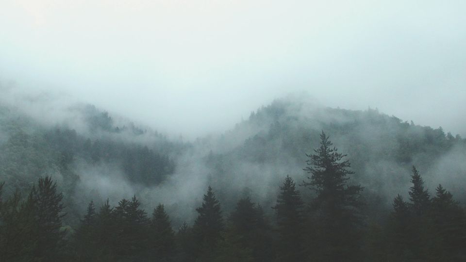
Your Music is Slow - Your Cover Shouldn’t Be
Ambient music takes its sweet time. It unfolds. It breathes. Your listener might sit through a 12-minute drone track where the most dramatic event is the appearance of a high-pass filter. But your cover? That has to work instantly.
Think about the Spotify or Bandcamp browser. A potential listener scrolls past dozens of covers in seconds. The right image (moody, mysterious, elegant, or simply intriguing) can stop them in their tracks and make them go, “Ooh. What’s this foggy mountain trying to tell me?” Boom. Click. Listen. You've just won the ambient lottery.
Abstract But Not Absurd
Ambient music often resists direct interpretation, and your visuals can play along. That said, there's a fine line between abstract and "I just threw paint at a canvas and called it art." A well-designed abstract cover hints at emotion or concept. It might evoke stillness, movement, nature, machinery, dreams, or the haunting beauty of an abandoned space station. The trick is to make it feel intentional. Bonus points if you used modular synth cables to draw your own waveform-shaped mountains.

DIY Design Disasters (and How to Avoid Them)
If you’re designing your own cover, I salute your indie spirit. But here’s a gentle reminder: just because you can use 17 different fonts doesn’t mean you should. And if you’ve applied more Photoshop filters than there are tracks on your album, maybe step away from the mouse.
Stick to visuals that reflect your music's mood and tone. That grainy black-and-white photo of a hallway? Perfect for a lo-fi ambient drone album. A digitally warped photo of an old TV? Nice touch for glitchy modular explorations. A badly cropped image of a unicorn with Comic Sans text? Maybe save that for your kid's birthday party invite.
In Conclusion: Make It Feel Like the Music Sounds
The best ambient covers don’t just decorate, they communicate. They let your audience feel something before they've even pressed play. Think of your cover as part of the composition. A visual overture. A friendly, fog-shrouded invitation to come and get lost for a while.
So take the time, find the right vibe, and for the love of Brian Eno, please double-check your font choice.